A Brand Voice Shift for Blue Nile
The Challenge
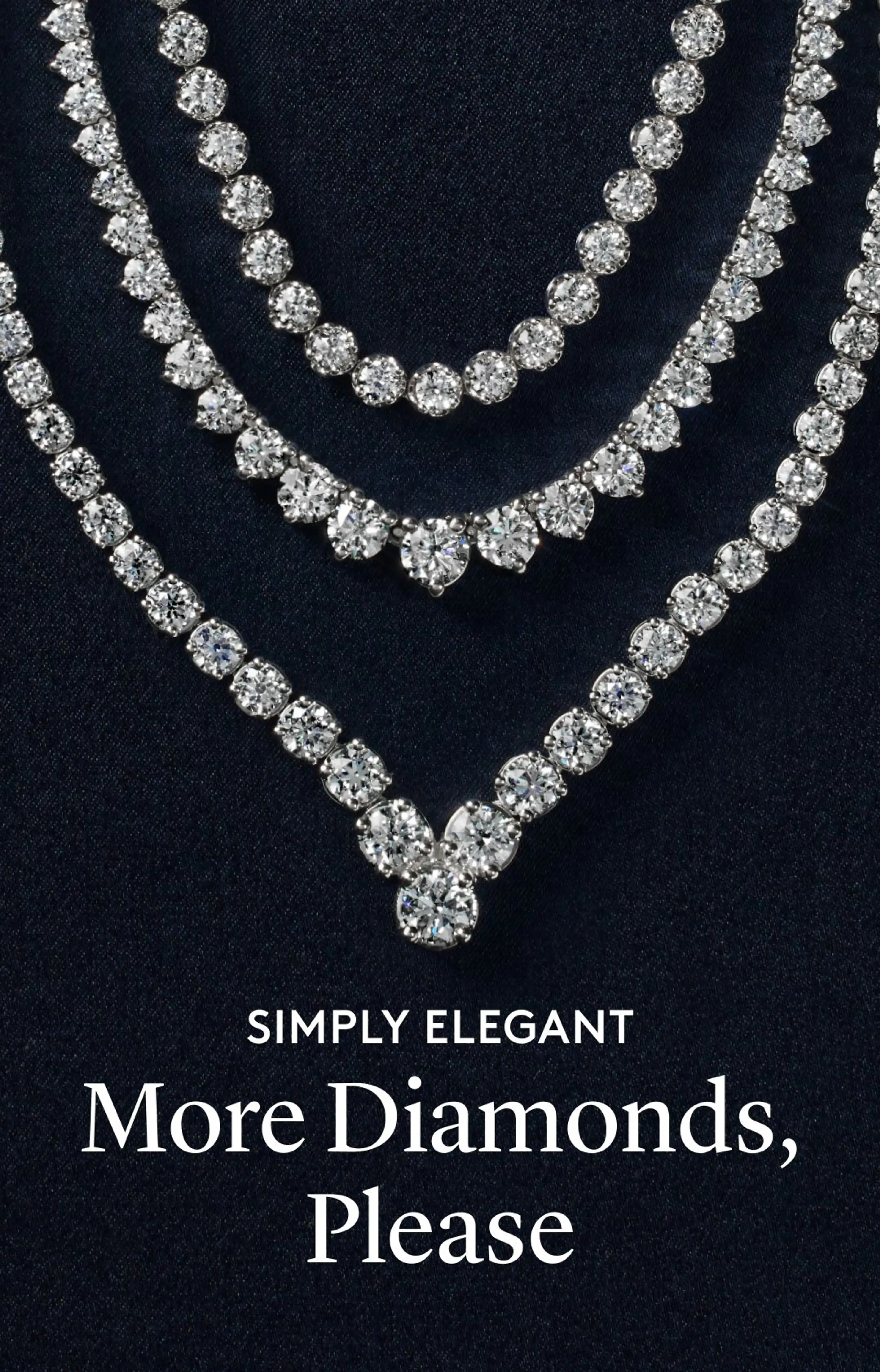
As Blue Nile moved toward a more modern expression of everyday luxury, its messaging needed to evolve with it. The brand needed to feel more approachable and playful while still maintaining the sophistication of an established fine jewelry brand.
My Role
As a copywriter and messaging strategist, I helped define how the new positioning came to life through voice and messaging, creating a consistent yet flexible foundation across customer touchpoints. My work spanned creative concepts, brand voice, collection positioning and naming, campaign messaging, email, paid media, social, and more.
Brand Voice & Multi-Channel Copy
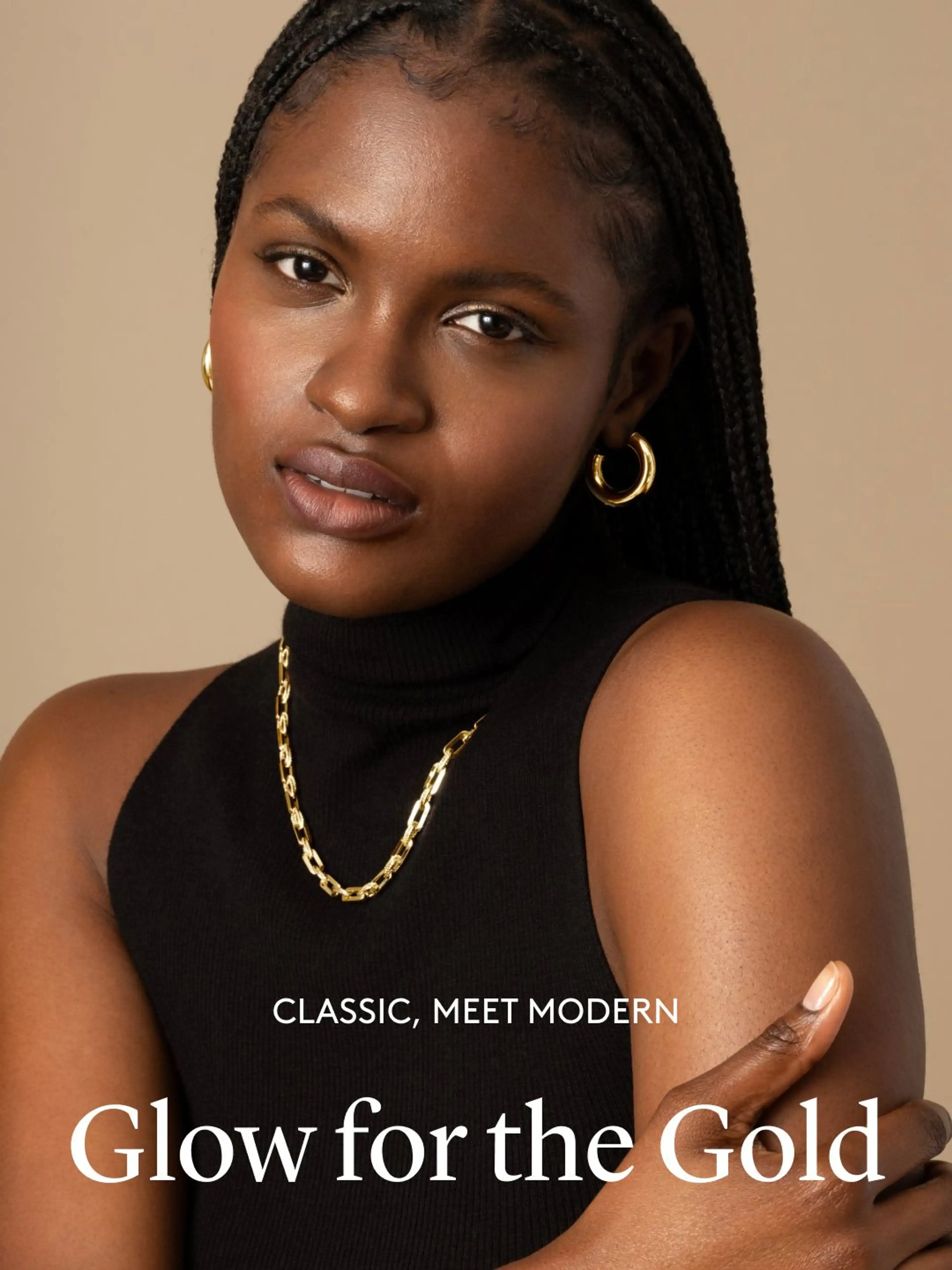
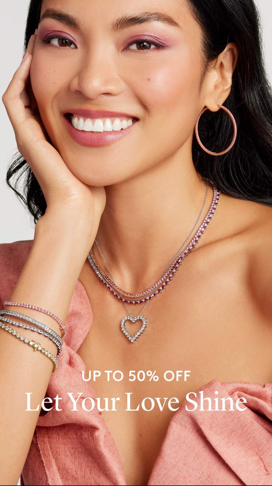
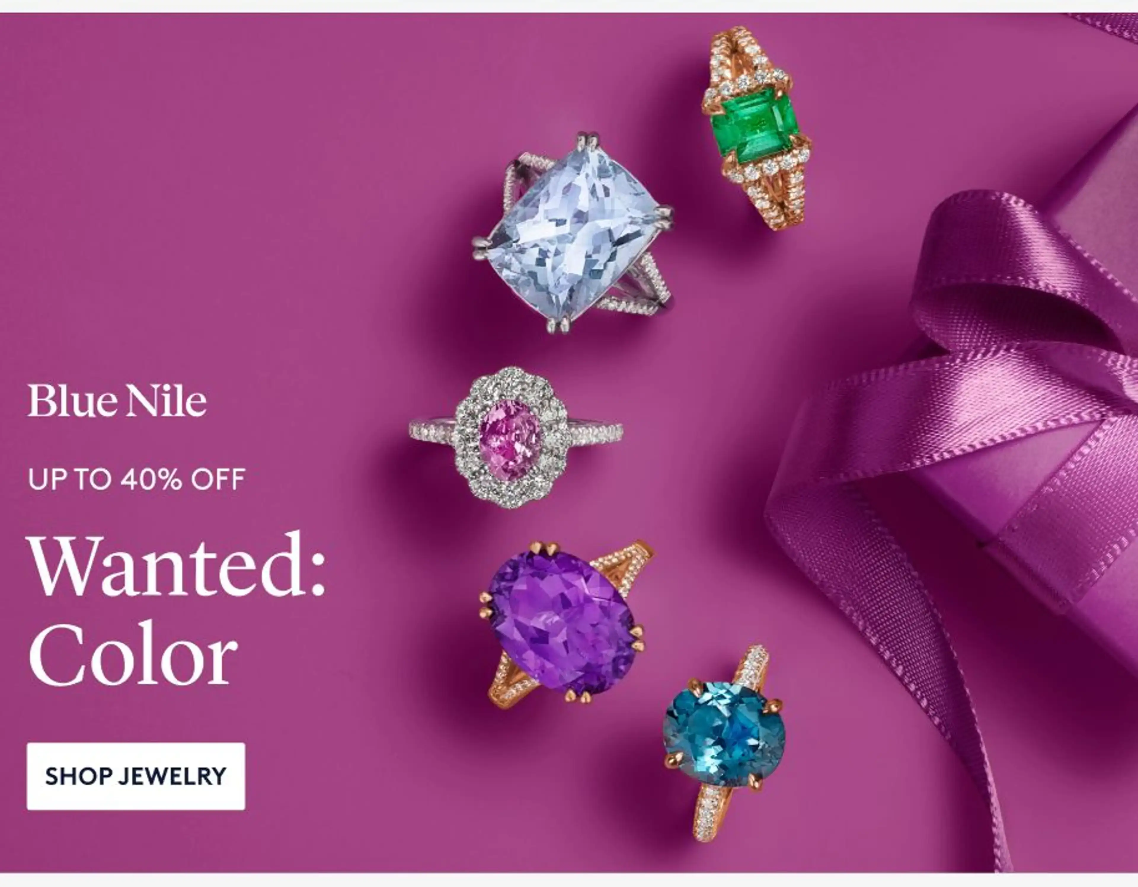
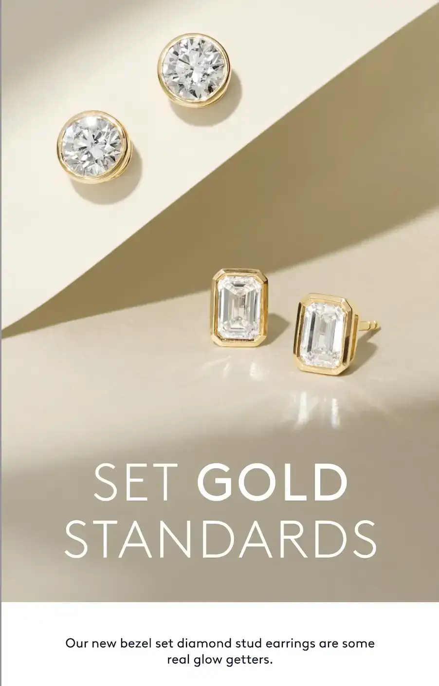
Outside the Lines
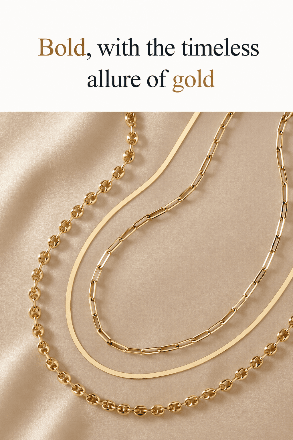
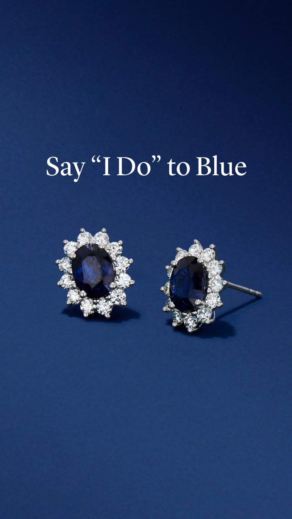
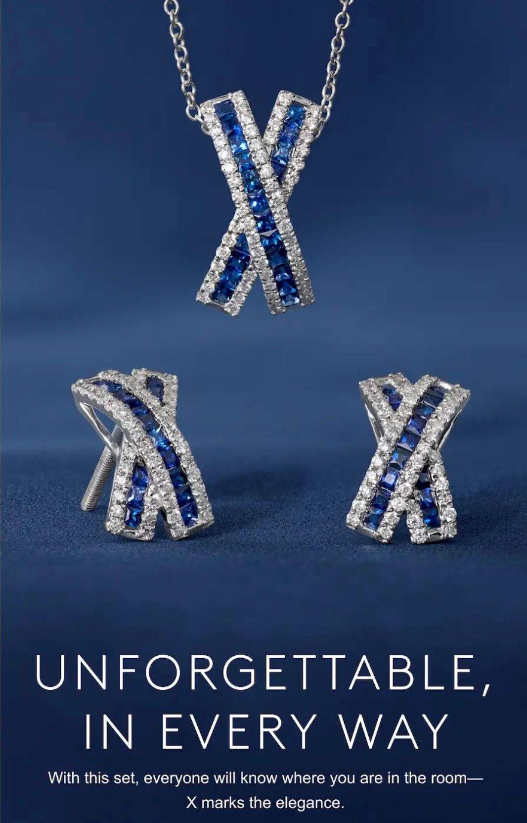
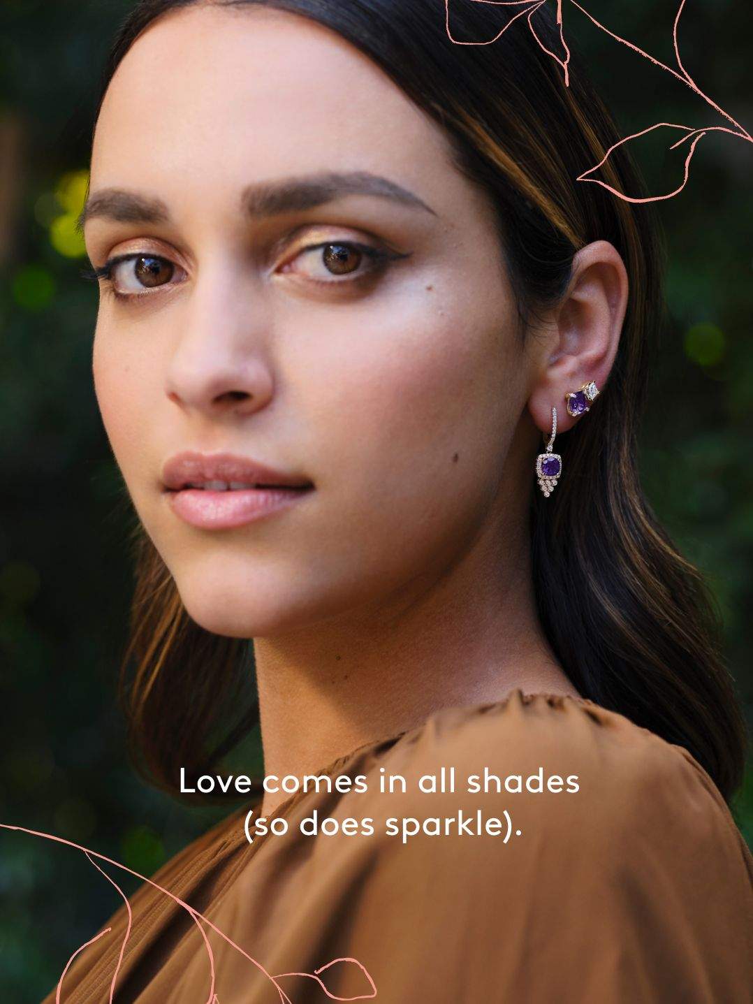
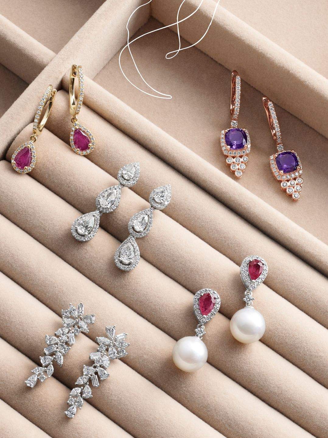
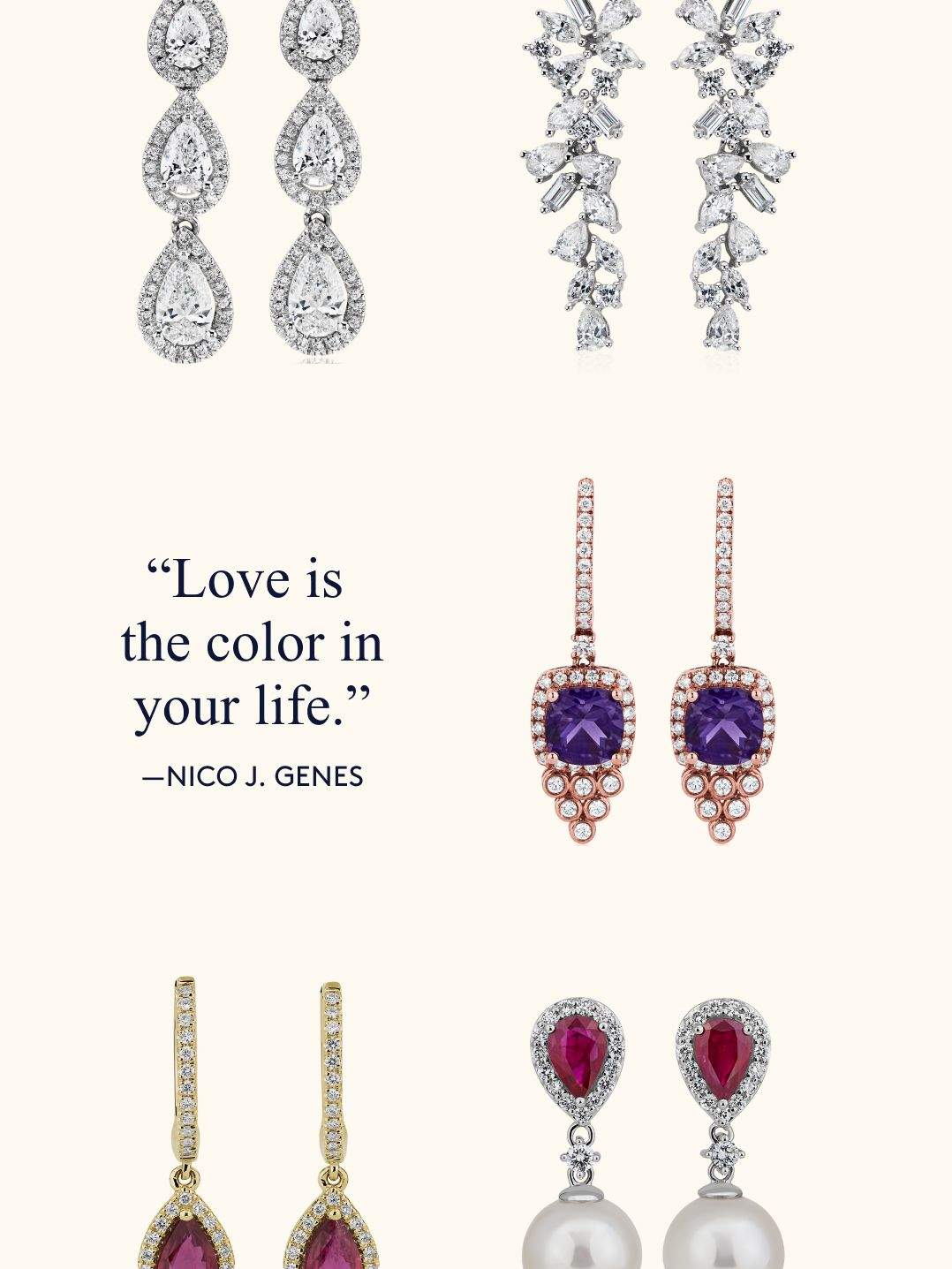
I see the lines, but I also see the colors that could go outside them. And sometimes the best way to capture attention is to do something unexpected. So, during my time at Blue Nile, I placed text in color (in collaboration with our designers), utilized rhyme and poetry, and even experimented with just a headline in an email and no other copy—besides product names. This is one of my favorite examples.
Promotional Campaigns
Early Holiday
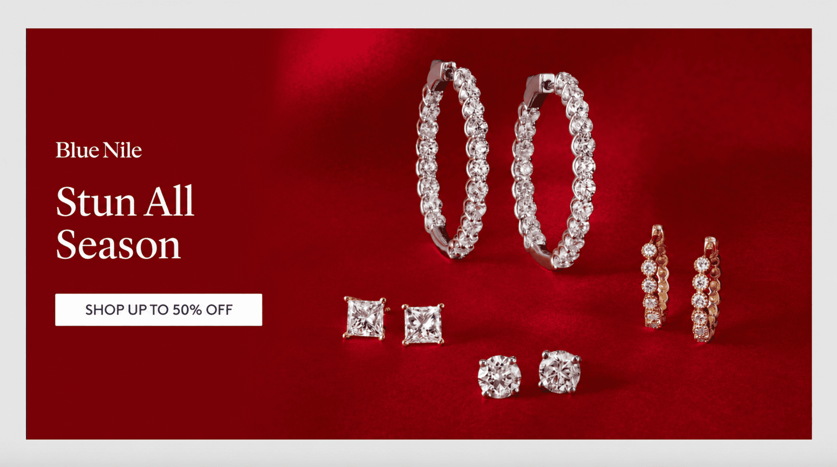
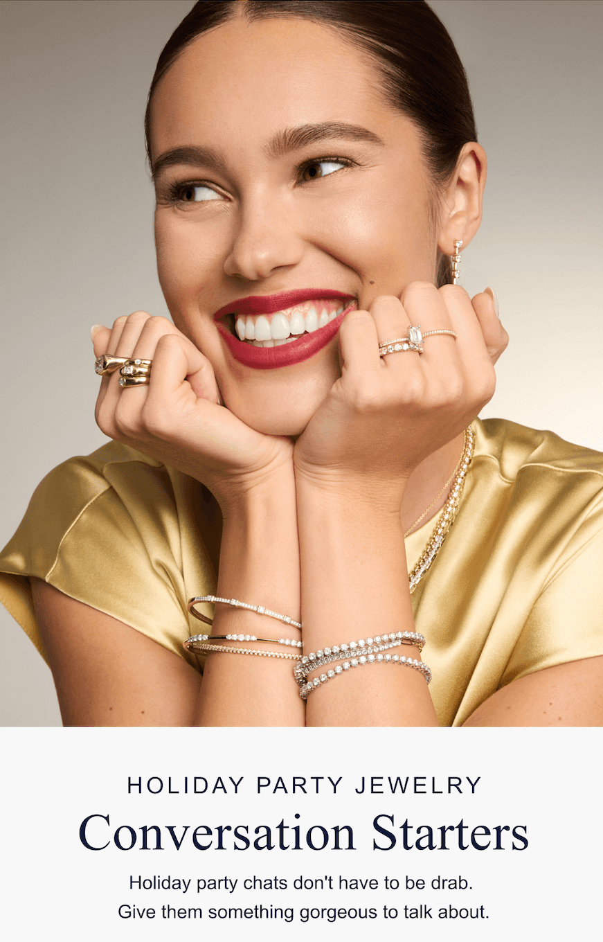
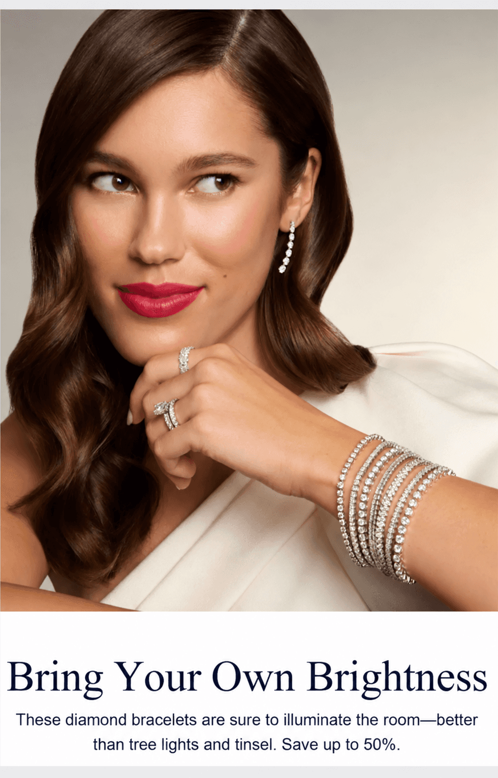
For this early holiday promotion, I developed a playful creative concept that tapped into the excitement and glamour of the season, making fine jewelry feel celebratory and distinctly of the moment.
Mother's Day Sale
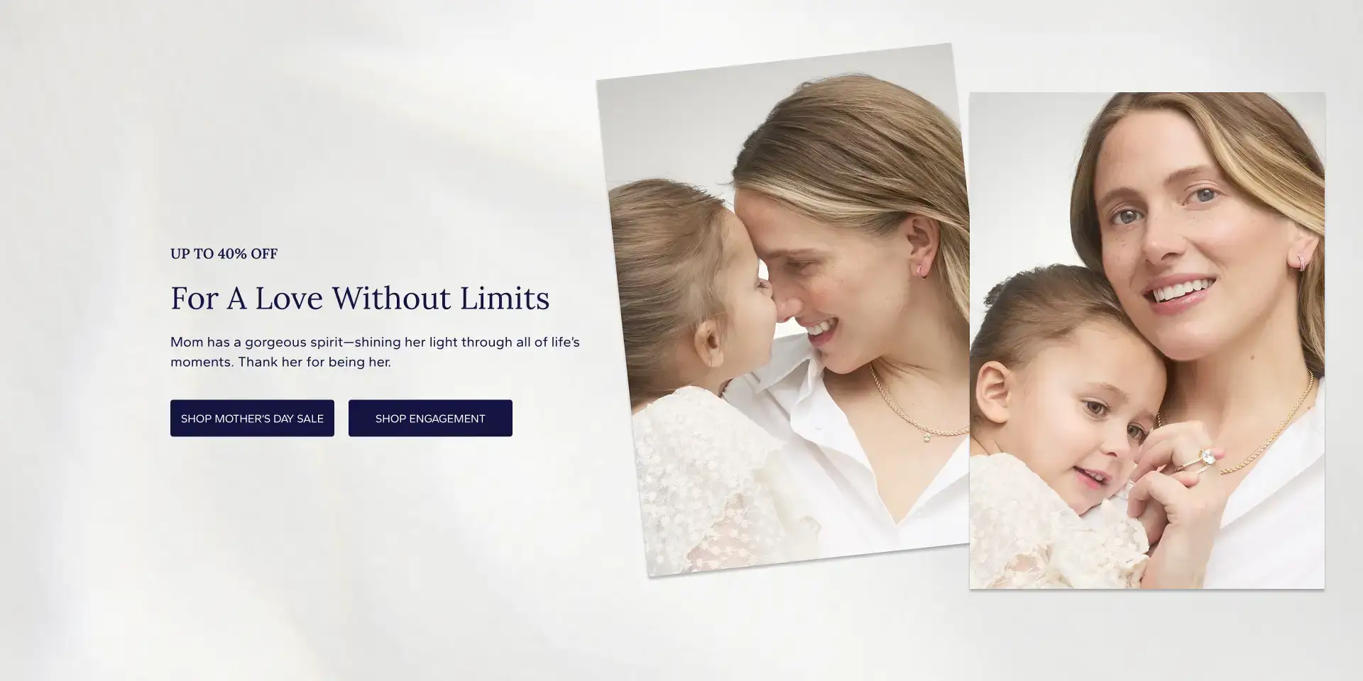
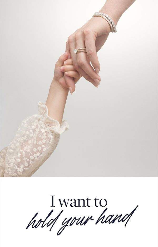
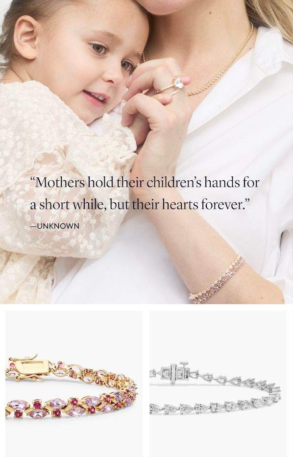
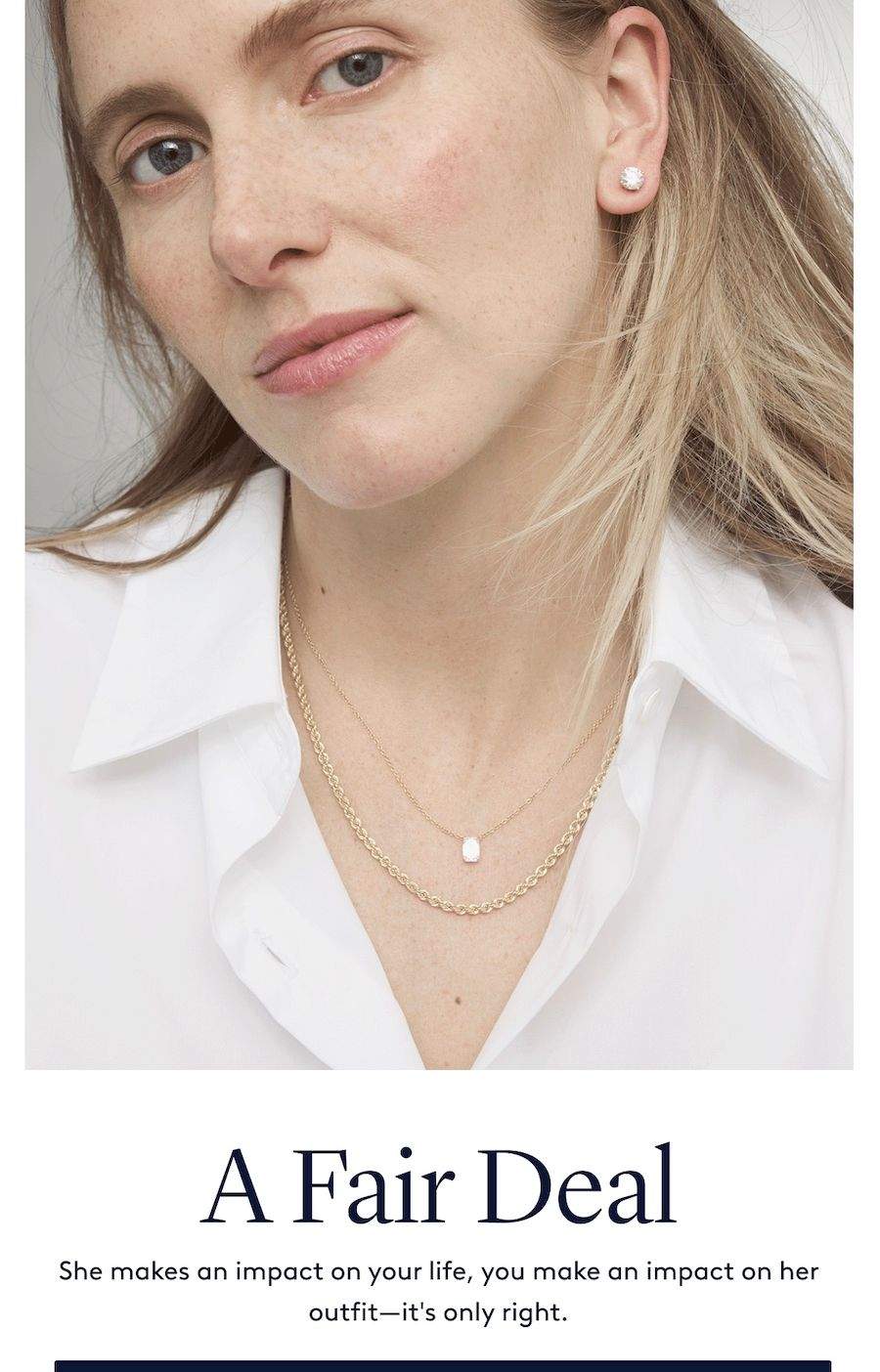
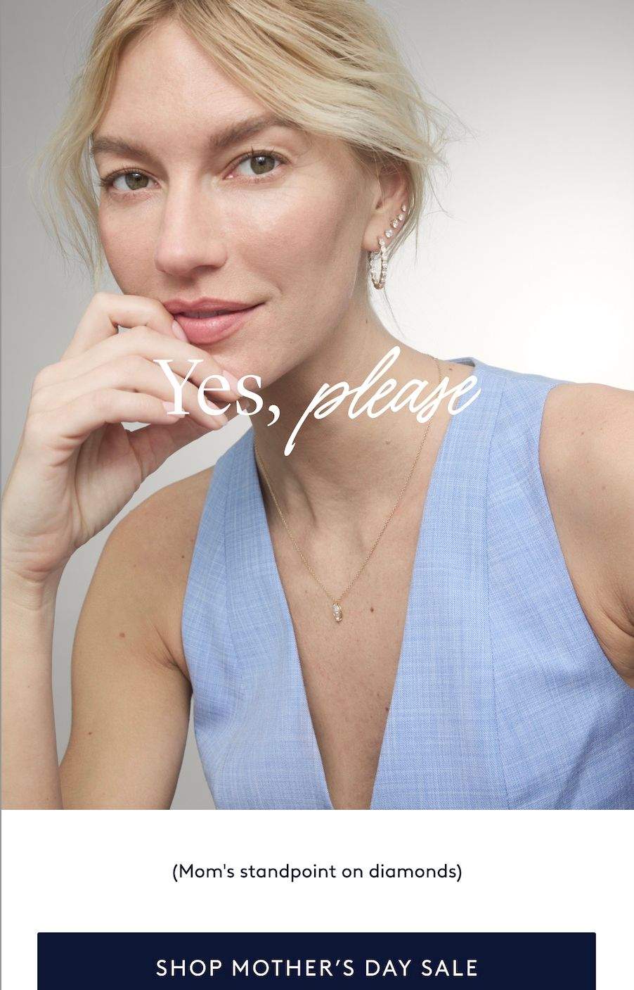
The creative direction for this promotional campaign centered on a real mother and daughter. The messaging drew on the enduring connection between mothers and children. We also featured images of moms on their own, where we had a little fun highlighting what Mom really wants for Mother’s Day. Bringing together heartfelt emotion and playful honesty felt like a natural way to reflect the experience of being a mother.
Branding for a New Collection
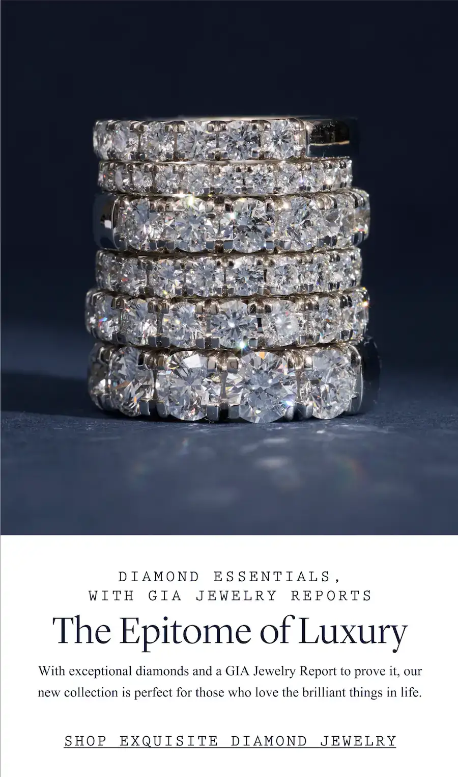
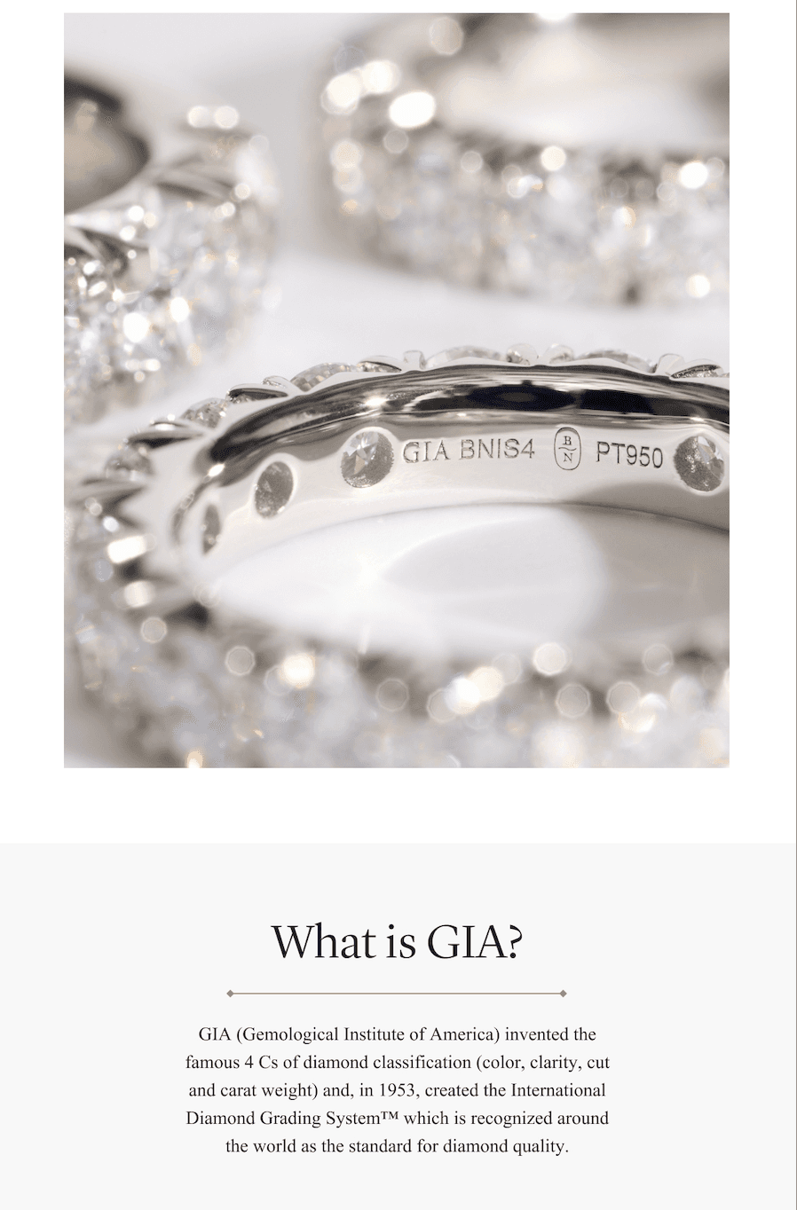
Blue Nile was the first to offer a collection of this kind featuring GIA Jewelry Reports, developed in conjunction with GIA. The messaging needed to communicate what made the collection exceptional while navigating specific restrictions around how the GIA relationship and reports could be described. I developed the positioning and messaging strategy to highlight the collection’s quality, craftsmanship, and distinction, working closely with a designer on our team to bring the story of elevated luxury to life. This messaging extended across company-wide talking points and customer-facing communications.

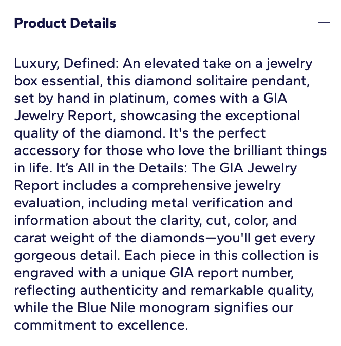
Showcasing Products
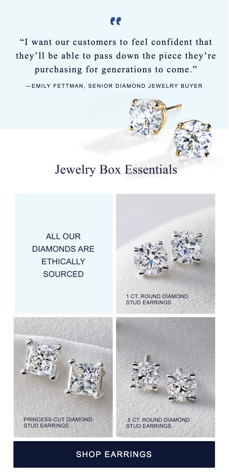
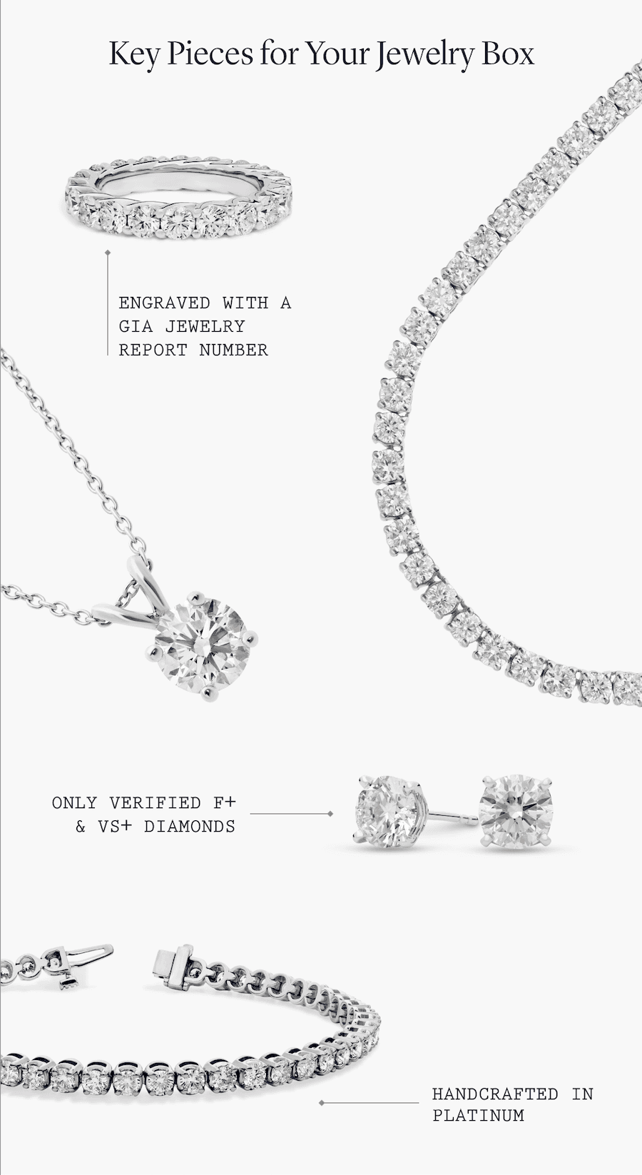
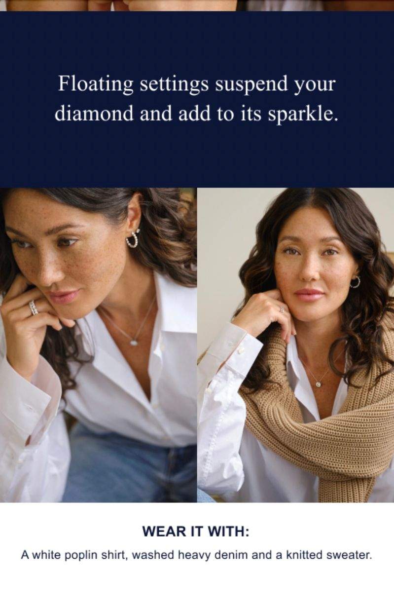
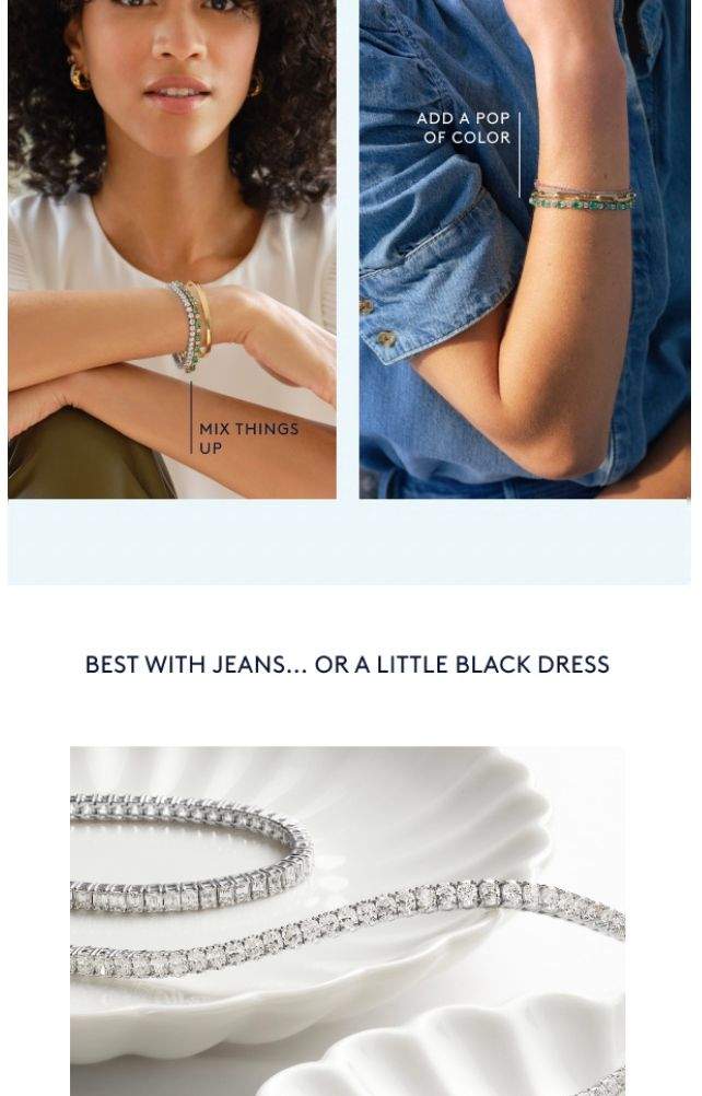
During my time at Blue Nile, I worked to elevate how we showcased our products, partnering closely with the merchandising team to uncover unique details, highlight craftsmanship, and gather expert insights and quotes. I developed the messaging and strategy behind these stories, collaborating with designers who also contributed ideas for highlighting products and helped bring the work to life. Through thoughtful product callouts, clear, engaging descriptions, and “Wear It With” styling suggestions, we highlighted each piece’s unique appeal and helped customers envision it as part of their own wardrobe.
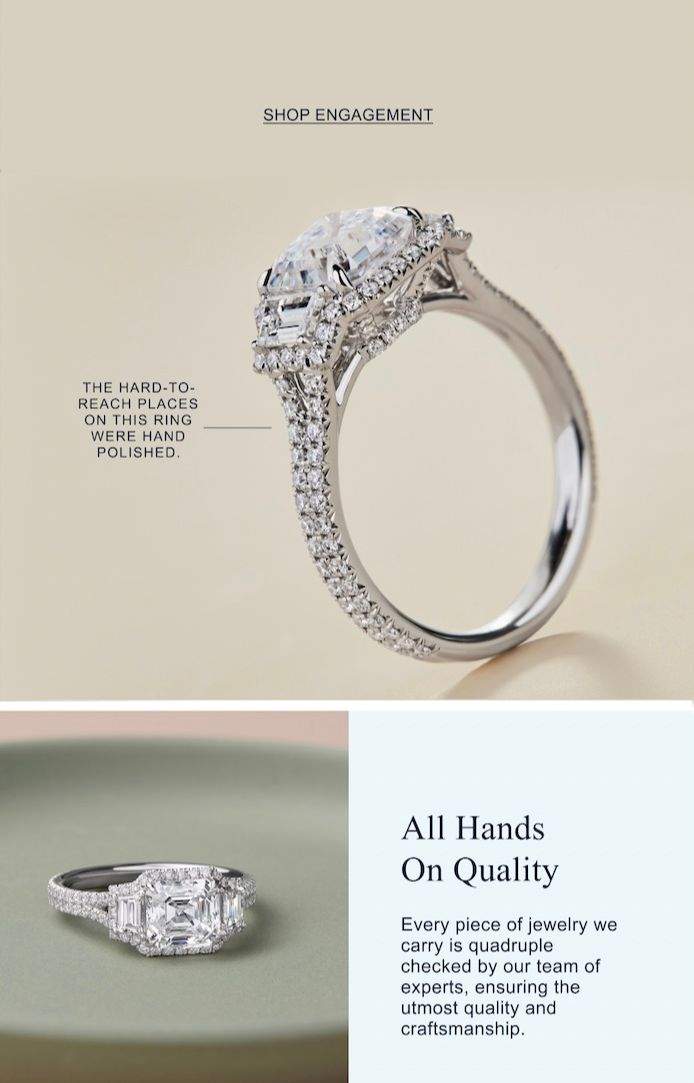
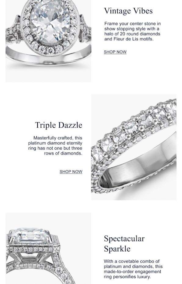
Abandoned Cart Series
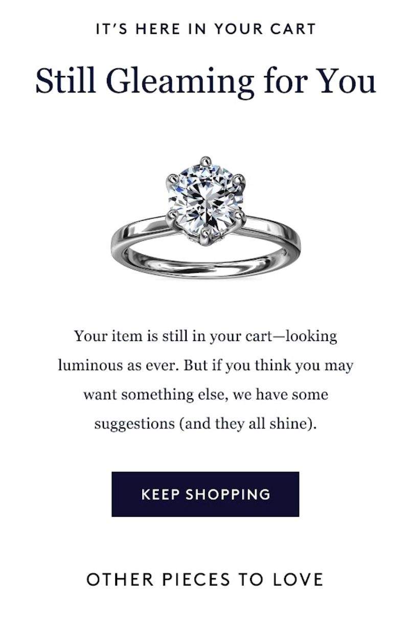
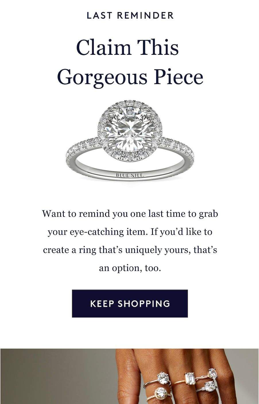
For this abandoned cart email series, I crafted messaging designed to re-engage shoppers and encourage them to complete their purchases. The copy balanced gentle persuasion with Blue Nile's sophisticated yet approachable brand voice, creating a more personal experience at a key moment in the customer journey.